This project has been absolutely crazy, in the best way.
I don't even know where to begin. I've learned so much with this being the first interface that I've attempted to design.
First off, I'd like to thank all of the hardcore fans of the original game that were excited by the idea of this project, and who gave me a much needed morale boost towards the end of the semester. Your enthusiasm didn't go unwarranted.
Lastly, I'd like to thank my friend and mentor, Dave Inscore, for agreeing to giving me advice and feedback on this project at all. I've become a better designer and an artist overall, and a big portion of my development over the past little while I'd like to credit to you and your advice.
I'm looking forward to taking everything that I've learned from this project and being able to make something new and exciting. I would like to be able to continue working on this project eventually, and I may indeed come back to it, but for now here's to the future!
Be sure to check out the final project on my website, complete with a gallery and style sheet!
Update from the end of the semester
Hey all! Here's the final clip of the project that I made at the end of the semester. It's getting uploaded now because I'm finally getting access to some internet on my holiday break that isn't my phone's data plan.
Some general notes from Dave on this last stretch that I'm working on having implemented by the time I get back from my holiday break --
1. Spacing issues with text on buttons - primarily the tabs underneath the Resource and Psych area got shrunk accidentally, and "Resource" is starting to hang off of the edge.
2. Change the color of the white text on non-selected buttons to be a brighter version of the color of the button. It will look more refined and less pasty.
3. Rearrange the order of the video to make it look like less of a random walkthrough of the UI, and arrange it in a way that looks like it's being used with an end goal in mind.
Something that I'd like to address is the readability of the resource icons and their numeric values. I'm also working on a start menu. An example of the original is below.
Overall, at this point I'd just like to say that I've learned so much from this project and being able to work on it with Dave. Before this I hadn't ever worked on making an interface for a game, as I had only done things like make art assets like icons and such. I hadn't really gone through the steps of thinking about how things flow and how best to place things on screen to draw the attention of a player. This project helped me really think about these things and more, and it has only gotten me more excited to continue working on UI projects in the future.
Final stretch of the semester!
This pass was all about getting in the new icons for Resources and Energy Management. One more week left in the semester, and it's going to be spent on polishing what I have. So far I've hit the milestones I've set out and completed the amount of content that I said that I would at the beginning of the semester.
Feedback from Dave:
- Noticed that I've got my colors sorted out for the most part.
- Wants red buttons reserved for negative actions like the Nerve Staple button. So I need to change the color of buttons that have positive actions to something like green.
- Change colors of ornamental lines (brackets in corners) on the Discover tab to be a vivid bright orange instead of white.
- Overall look where I've made highlights that look white to less white and again more like a brighter vivid color. Reserve white as the last little thing that gets added at the end for extra pop. Example, the selected tabs (Resource, Support, Psych) look pastey, make more vibrant.
- Reverse the gradient of the bar graphs on the resource information.
- On button mouse overs, I should incorprate them breathing out -- similar to how on the click I have them breathing in.
- New icons look nice, make the resource icons smaller than they are now.
-
Adding polish and changes to feedback
Hey guys! Sorry for the length between this and the last post. I took some time off to celebrate the holidays and to work on things for work and school. Something really cool happened during that time though! I got featured on an article on Rock, Paper, Shotgun!
And then that article got featured on PC Gamer!
A fan of the project then informed me that this project also got picked up by the German PC gaming site GameStar
Really, I greatly appreciate the interest that these articles have garnered towards this project. Something that got mistaken in the PC Gamer article though was that this was going to be a mod. There's a disclaimer in the about section of this site that clarifies that this is indeed not a mod. While that would be a really great thing to see in the long run, I have really limited coding experience as I'm primarily an artist. I currently have no plans on releasing this as a mod. Right now I'm just focused on continuing to iron out what I've made for this project so far, and stomp out any fires that pop up every now and again. This is a learning experience for me. I've learned so much in the span of the few short months that I've been working on this with Dave, and I can't wait to keep up the pace in the coming weeks up until the holidays.
During this most recent pass I've done a lot towards making button colors more saturated and less muddy in their colors. I've also made the colors in the design workshop screen more consolidated and refined. After that in the main HUD I did a lot of work in getting the color schemes there to line up with the color schemes everywhere else, and to also get those animations put in and looking all nice.
UP NEXT on my list of polishing items
- continue to refine animations (mouse animations can be a little jerky at times)
- continue to work on colors
- Refine my temporary resource icons and energy allocation icons because those things stick out like a sore thumb
Most recent round of feedback -- currently in the midst of implementing changes
Note: The nutrition/energy/mineral icons that pop up when the resource tab is clicked are placeholders. The original game showed icons when the resource tab is clicked, so I needed to have something pop up when I had my tab clicked, but the priority of making great icons for something like that is at the bottom of my list for right now.
Diplomacy v1
sketching out ideas to show thought process
Diplomacy v2
The first thing Dave pointed out after watching this is that in the first screen, he doesn't like the light text on selected tabs and darker text on unselected tabs. He had suggested that I go in this route, but seeing it in action he prefers dark text on light buttons and light text on darker buttons. "Clarity", he says,"there needs to be no question about what my options are as a player."
Second major thing that he wants to see in the next pass is that need to consolidate my color scheme. Each time I move to a different part of the project I accidentally introduce different versions of colors that I've been working with. Moving forward he doesn't want anymore blueish text on orange buttons. Make the colors of the text either be white or black for clarity, and if I use glows make sure that they match the color button they're on.
Third, he'd like to see me finish off this project this semester with stronger button designs. Cool buttons will really help sell this project some more.
A few side notes and nitpicks
- consolidate the box shapes in the HUD, decide where beveled corners and squared off corners go
- look at Valve and their color scheme decisions -- similar to what I have going on now
- whites and cyans are getting mixed -- go back and adjust everything to make unified
- transparent buttons are losing their base color and getting muddy due to the game's environment showing through them -- test out how they look not transparent
- Boxier more sci fi type is suggested for buttons and headers -- he brought up something important concerning UX and localization. The type that I chose for things like the city title have kerning that's too wide. If translated into another language like German, the titles wouldn't be able to fit.
- Lily of the Valley "button" doesn't feel like a button at the end. I need to either redesign that or do something to make it more clear that it's something that can be clicked on.
- Introduced an "X" in the top corner of the diplomacy screen when there's an OK button -- redundant (note to self: don't feel the need to implement new functions to the UI at 5 in the morning after a night with too many Red Bulls)
-- Extra note to self: tighten up animations for the main HUD after leaving the Design Workshop screen. Make things popping on screen feel extra tight and not slow and labored on.
Ref that he threw my way --
More sci fi kind of type for buttons.
Black Ops 3
Digs the clarity that Treyarch has going on in the Black Ops 3 UI. Dark text on highlighted buttons with light text against a dark background.
Got some new changes to the overall look going forward
So during this most recent pass I've gone in and changed/tweaked a lot of small details.
Original Governor/City Management Screen
Governor_v1
Originally I went in and I started adding some shadows underneath all of the information to help make things pop out, and eventually I realized that I've been trying to save this style that I developed for the borders of the HUD boxes since like for since like...September, which was pretty early on in the development of this. So I went and I started looking and looking at a bunch of ref, looking at current and older games. I came to the conclusion that the transparent blue borders in their current form look kind of hokey and aren't in line with the original goal of this project which is to bring this older game's interface and modernize it. I also realized that the drop shadows in their current iteration are too strong and obscure the gameplay just as much as I knocked the old interface for. I need to dial things back and refine.
Governor_v2
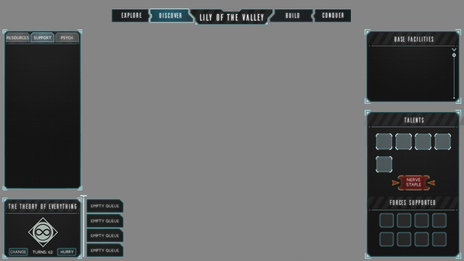
Here I've kept all of the same information and layouts, just refined things quite a bit in my opinion. I've cut out the transparent cyan borders in favor of a more solid slightly transparent black with a thin 1px edge. This feels more "modern"/sci-fi to me, personally, and I like where this is starting to trend. The bright transparent cyan borders were just fighting with the information too much. The purpose of an interface is to convey information to the player, but what's the point of it if the thing is fighting for the player's attention over what they should actually be focused on. The one place where I've kept the bright cyan border is on the city title, because it's going to be clickable to exit this screen and knowing which city you're managing is an important piece of information, and it also draws the eye to show which "Governor" mode the city is on.
Something I would like to improve on is some more cool little lines/decoration to help amplify the sci fi-ness of the now slightly boring black gridded rectangles. Also more interesting shapes for the bar graphs for Nutrients, Minerals, and Energy.
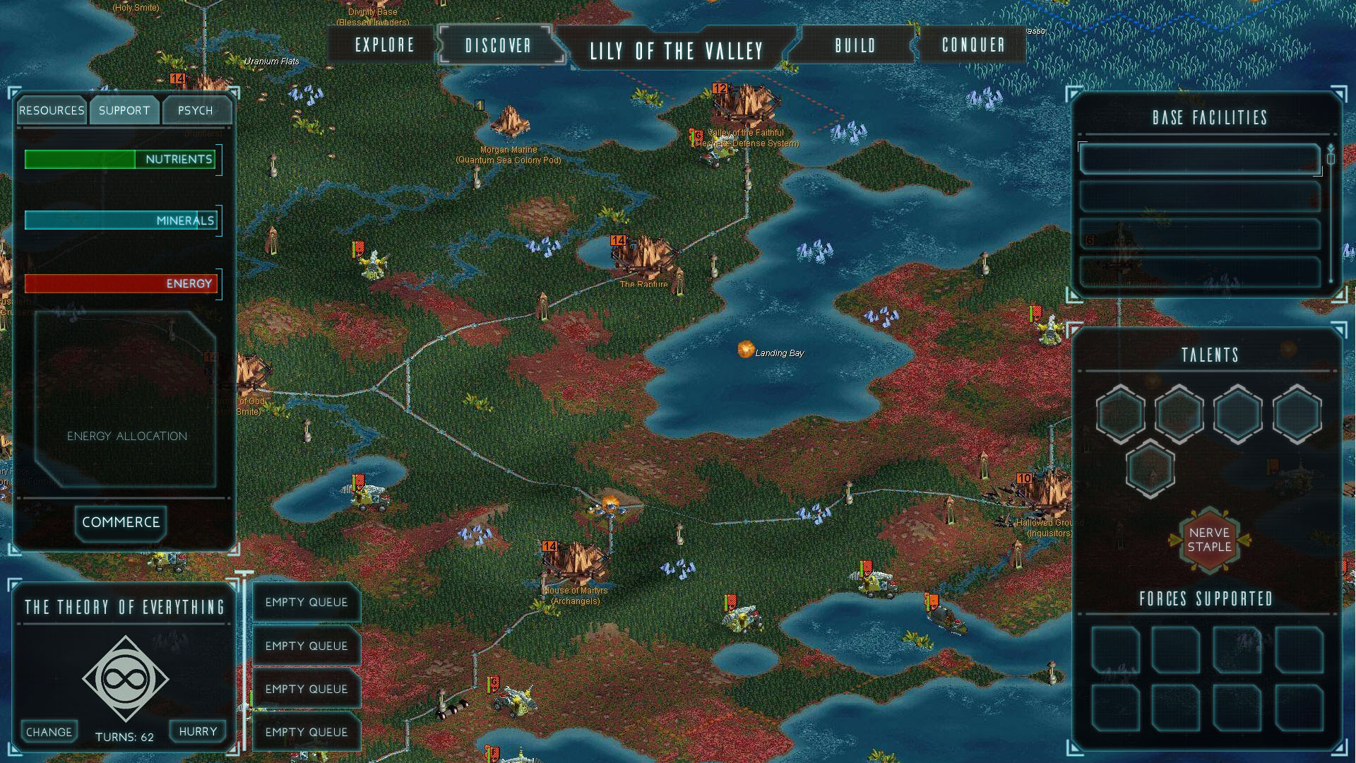
MainHUD_v1
Here is the current working concept I have for the main HUD. The development of this is actually what prompted me to go back and change the look of the menus in the Governor/City Management screen. I couldn't get those bright transparent borders to look right with all of this information. I need to bring some of this transparency back over to the Governor menu, or the transparent black borders from that screen over to this screen's HUD to make things consistent though.
Some thing I think that I can improve upon in the next iteration is to make the shape of the selected unit box more interesting, either by changing the shape entirely or adding some kind of sci fi decoration to make it more visually interesting than a square in the corner. I'd also like to give a button on the mini map that allows the player to change the orientation/zoom in or out depending on their preference.
This was also where I added some improvements to the top information bar. In the original game there are actual screens that take up a bunch real estate with cycling information/in game statistics. An idea I had to simplify this was to take all of the commerce/economic stats that keep cycling and have them scroll through the top bar like you'd see on the news/ESPN where they have stats/breaking news/stock market statistics cycling through on a banner.
Original HUD
Some ref from other games that I've been looking at recently--
Civilization Beyond Earth
Stellaris
Stellaris
Galactic Civilizations 3
Offworld Trading Company
I'm always gonna be looking and comparing to Civ Beyond Earth, since that game is the spiritual successor to Alpha Centauri in a way, I'm always mindful of how my concepts and trending/stacking up to what is going on in that game. While the visual style is notably different (I'm going much more angular and boxy, whereas Beyond Earth is going with rounded buttons and flat boxes that taper off into transparency).
Stellaris is another game that's still in development that has really cool things going on in their UI style.
Galactic Civilizations and Offworld Trading Company are both games that I've started looking at that definitely has cool things happening with their UI in terms of handling a lot of information on screen i.e. numbers and resources.
A lot of changes going on -- learning about typefaces and typography
Note: The nutrition/energy/mineral icons that pop up when the resource tab is clicked are placeholders. The original game showed icons when the resource tab is clicked, so I needed to have something pop up when I had my tab clicked, but the priority of making great icons for something like that is at the bottom of my list right now.
Old Style Sheet
My previous conversation with Dave about the happenings of this project, he made a big point that I still have a ways to go on reigning in the inner glows and outer glows everywhere. He wants everything to feel more crisp and controlled. I should also start thinking more about the type sets that I've been using because the current ones that I have feel a little "juvenile" or "kiddish". He suggested I look for some advice from people with more experience in graphic design. Colors are also getting kind of muddy and not as saturated as he'd like. The divider lines in the UI are also too strong and are commanding almost as much or more attention than the titles, so I need to either get rid of them or knock them back quite a bit. The information I have under Energy Allocation also needs to be organized in a better way. It just needs more structure and be less floating text.
I spent a fair chunk of time going out and looking for more typefaces that look more thought out than googling "good free typefaces". And just in general going back and working in all of these suggestions into the style sheet before I start implementing the changes everywhere else and animating them.
New Style Sheet
So in this new style sheet, what I've done is I've taken out all outer glows for the vast majority of things. Reducing all glowed strokes to 1px, and almost all inner glows to 2px with the exception of the inner glows of the Nerve Staple button, which I left because I think A) it draws significance to it, and B) I think it looks really cool. I've also gone in and added some a little bit of texture to everything, pulling some reference off of Andre-L Huynh's "No Way Out" UI designs.
Typefaces/Families I'm looking at and why (I'm not traditionally a graphic designer so take all of this with a grain of salt and the knowledge that things like typefaces are still a learning process for me) --
Really really digging the DIN family of fonts. One caveat here is that real fonts cost money, a luxury that I don't necessarily have with my college student budget. I found a free font that is essentially FF DIN Pro. I think I've settled on a family of fonts for all basic information. It's clean and it's really legible. The letters aren't too round, and the spacings aren't too wide.
I really like the Futura family of fonts. I think that they're really clean. I think that the Oblique version of Futura could work well as a Header/Title font, but part of me feels like it's too round to fit the more geometric aesthetic that I have going on. So I'm still on the outs with that one. It's a contender maybe for headers/titles.
ISOCT looked cool when I saw it on the web, but in use it's too light and can't be read.
Looking for something for a button typeface...I'd like something that doesn't look overly cheesy and sci-fi. I like the footprint and legibility that Dyno and Aero Matics have. I think Aero Matics might work better for things like buttons, because it's slightly boxier and will fit that space better.
https://www.artstation.com/artwork/y40yQ -- Work done by Andre-L Huynh
Civ Beyond Earth
Civ Beyond Earth
Endless Space
Another thing I'd like to implement in the next pass are some shadows/gradients to help the UI pop out against the background, because I do think a weakness that my UI boxes are running into is that the cyan/blue edges are transparent and can get lost against the game world.
Civ Beyond Earth
Adding some whiz bang here and some pizazz there
Got some feedback from Dave this week, since its been a bit since we've met up and he's been able to check out what's going on.
Right off the bat, he'd like to see more saturated colors everywhere. Partially that's my fault for designing everything and then dropping the opacity and putting them through different blend modes in order to get the transparency effects that I have going on almost everywhere. This is something I'm going to have to address with some color overlays, or that I can go in and add some magic via After Effects and this lovely lovely plugin that I adore so much -- http://www.videocopilot.net/tutorials/color_vibrance_plug-in/
He likes that I've gotten control of my type choices since the last time he checked it out. Previously when he had seen it, everything was basically stuck in CAPSLOCK and he felt like the interface was screaming at him.
Like I mentioned in a previous post, I've been messing with differentiating selected buttons from non-selected buttons. I've been doing this by changing the text color to solid black to stand out against a brighter background, but Dave says it's not working. His eyes were more drawn to the two tabs in the beginning that aren't selected, so I should switch my thinking on what's going on there.
He liked the icons that I have going on at the moment. Likes that some are centered, some go to the edges, and some are angled. He doesn't like that when the research icons all drop down, it's a wall of the same drab color. So like I was thinking in a previous post, I'm going to have to revisit my approach with the icons and introduce more colors. Maybe I can be successful with a 2-3 color scheme -- background, details, main focus of the icon.
Another thing regarding the icons, he's interested in the shape language of the boxes and the icons enough that he'd like me to explore adding a cool mouse over flare for them since those would be clickable.
Lastly, he's a big fan of the flashiness of what I have going on in the "Design Workshop" screen. Again I need to address how the colors of things are skewing towards muddy and change them so that they pop and make things more interesting to look at, which is going to help it even more because the animation whiz bang stuff that I have going on is heading in such a cool direction.
Really liking the direction this project is trending in now. I really like mocking up animations to show how all of this stuff will look, and I feel like getting the Design Workshop screen down was a pretty big step, and the pizazz that I have going on there is going to affect how I approach animating going forward. Part of what makes it so successful in my opinion is the speed of things appearing and moving on the screen. Up until this point I feel like most of the animations have felt very labored and heavy handed -- while it's hard to make glowing buttons exciting, I do still feel like I can speed things up in the beginning portion of this animation quite a bit. There's still a lot to do, and things from the previous blog pos that I haven't gotten to address, but I'm hoping that this next week will just be all about the polish of things, and less about adding content.
Continuing to adjust and make improvements, but this time in motion!
Here's my most recent iteration of things in motion, using animation states from my most recent Style Sheet. From here on, I'm going to continue to add to things while going back and adding more whiz bang effects and animations on top of older elements.
Things I'm noticing now that will be addressed in the next animatic -- not enough attention is being drawn to the Talents section when the "Psych" tab is clicked. The shiny glow I have going on in that divider is just not noticeable in my peripheral vision. It should be more noticeable to draw my attention away to the other side of the screen to show me what I should be looking at. Also, the timing of the transitions between selected and not selected on the "Resources/Support/Psych" tabs is clunky and slow. I need to speed that up.
The rest of this post is going to be going into how I got to what is being shown in the animation.
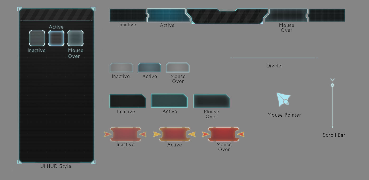
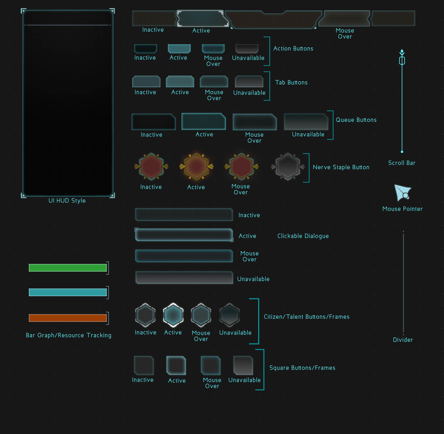
Style Sheet
This is my most recent Style Sheet, which I'm using as a guide for the different animation states shown in the mockup.

We have Icons!
Here are some more finalized versions of research icons based off of the sketches that were shown in the previous blog entry. I like the flatness of what's going on, but personally they're still a little muddy, and I'm considering bringing in a second color to help add more visual flair. As icons, some are still a little iffy on what they're trying to convey. "Stockpile Energy" is super on the nose and I need to make a version that sits better in that space. "Relocate Headquarters" should feel more like a fort, and less like a Rook in chess.
This version of the research screen isn't the one that was used in my animated mockup. I actually went back into this and scaled things down to give more breathing room so that the player will be able to parse this literal wall of information that they're seeing.
With Top Bar
No Top Bar
Here are two versions of the iteration that made it into the animated mockup. The only thing different is that I'm deciding whether or not to include the top bar, as that has information that could affect the player's decisions on what to research. I just liked the open space above the city name.
In the next pass I'm going to add more to the information happening on the top bar, which will make it more vital towards gameplay. I like how another 4X game like Endless Legend and Endless Space manage to go without using the top bar for information, and I think that Civilization: Beyond Earth might have too many different icons on its top bar -- I think I'd just like to find a balance between providing useful information to the player and providing too much information without context to the player.
Endless Legend
Endless Space
Civilization:Beyond Earth
Iterations, Tweaks, Thought Process and Inspiration
I've spent the past two weeks iterating and making even more tweaks on the styles that I've already developed so far.

Style Sheet 2v2
In this style sheet, I was iterating a little further on the previous one, attempting to add some more character to everything, making things seem a little less clean/flat/perfect. It was in this stage that I also experimented with how some of the button states would move when they're interacted with.
Feedback at this stage was to shrink the frames of the boxes, because they're getting too big and don't feel modern anymore. Same goes for the massive mouse cursor which was my bad for not sizing correctly when I imported it to After Effects.
Other notes are
-- 1) that the difference between the different states (unselected, mouse over, and clicked) is too small to be noticeable so I need to make that more apparent in the next pass
-- 2) the glows in the unit boxes under "Forces Supported" are too noticeable for unselected, those need to be taken back
-- 3) make the more important buttons different colors, like with what I have going on in the "nerve staple" button
-- 4) consider a background design for the interiors of the HUD boxes (the grid overlay I have on them currently wasn't noticed so I need to bump that up and maybe incorporate something else
-- 5) the typeface selection is improving, but everything everywhere is all caps and it's making the interface stand out too much, so I need to reign it in

Style Sheet 3

Layout Pass 3v3
So I've gone back in and applied most of the feedback from the previous round i.e. slimmer frames on the HUD, less CAPSLOCK text, and attempting to draw the eye to the important areas with more distinguishable button states/colors/text color. I'm going to see how I like having black text as selected text as a way to distinguish more from the normal light text on dark backdrop.
And now for something new. I've been waiting to post here until I had a little bit more refined iterations, but I figure it's my blog...so I'm going to start showing some sketches and places that I'm drawing inspiration from.

Icon Sketches
Here are some first pass sketches at some ideas I have knocking around for icons on the tech tree that the player can research in this game. It was an experiment to see whether or not this hologram-esque look I had in my head is feasable, and the answer is...it's not. At least in this iteration. Things look too mushy, and are losing their iconic-ness because of how mushy all of the glows are starting to make them look. So I think that a direction I'm going to push these in for a more refined pass is a one or two color flat icon with no glows.

Here'es some more experiments I'm doing with making the HUD backdrop feel more lived in with some textures. (textures found here -- http://elyssafawn.deviantart.com/art/Screen-Mode-Texture-Pack-546039287 )
Inspiration for the directions that I'm going to continue to take the icons in --
Other games I'm looking at for inspiration from their UI both aesethetics and how they function--
Endless Legend
No Way Out -- https://www.artstation.com/artwork/no-way-out-ui-design

Civilization 5

Civilization Beyond Earth
Progress so far -- what's working and what's not.
First pass
So, this project has been picking up the pace, slowly but gradually. The first thing I'm going about doing is redesigning the Governor/City Management screen. My thought process was that I want to give the game some screen space to breathe. The original Governor HUD took over the entire screen. I'm taking some inspiration from other 4x Strategy Games like Civilization and Endless Legend here and allowing the player to still see what's going on behind all of the dialogue boxes that make up this HUD.
The first big pass I did got pretty close to what I had in mind in terms of shape language -- angular and boxy, with a little bit of dimensionality from being transparent. Originally I went with a little bit of color, but felt like to really get the slick Sci-Fi feel that I'm going for I needed to make the overall palette more subdued with the main boxes being a transparent gradient of grey to black.
Second Pass
The second pass I did was to try and refine the look and feel of the shape language I'm leaning towards and start looking for some typefaces that would look nice with the UI overhaul. It's good to get a second pair of eyes on what I was doing though, because Dave was confused with the mixing of rounded buttons with angular shapes everywhere else.
Style Sheet
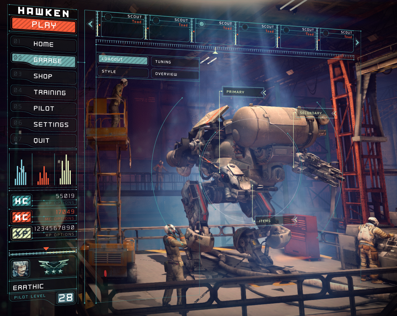
Another thing that wasn't jiving was the caution slashes. I threw them in to see what it'd look like because I similar slashes overlayed in HAWKEN's UI.
Third Pass
Style Sheet
In my third and most recent pass, I've consolidated the overall shape language to being angular and boxy, removing rounded buttons across the board. Dave's feedback on this pass was that it's looking good, but he'd like to see it have more character and be less clean overall. So from here on I'm going to be working on introducing some variations to the glows in the boxes so that they're not so perfect and consistent all the way around, that way they'll be more interesting to look at. Also on the list of things to do is keep looking for better typefaces that'll fit the vibe I'm going for.
The blog is live and the project is about to get rolling!
I'm super excited to finally get this project underway. There's a lot of ground to cover in a relatively short amount of time, but this is going to be a great learning experience. I'm also stoked to have Dave onboard for this whole thing. I remember I mentioned Alpha Centauri to Dave when I was thinking of what game to focus some time on to rework the user interface, and was pleasantly surprised to have unwittingly chosen the game that he had made UI graphics for when he was starting out in the games industry. Looking forward to a great experience making cool things.
- Keegan