I've spent the past two weeks iterating and making even more tweaks on the styles that I've already developed so far.

Style Sheet 2v2
In this style sheet, I was iterating a little further on the previous one, attempting to add some more character to everything, making things seem a little less clean/flat/perfect. It was in this stage that I also experimented with how some of the button states would move when they're interacted with.
Feedback at this stage was to shrink the frames of the boxes, because they're getting too big and don't feel modern anymore. Same goes for the massive mouse cursor which was my bad for not sizing correctly when I imported it to After Effects.
Other notes are
-- 1) that the difference between the different states (unselected, mouse over, and clicked) is too small to be noticeable so I need to make that more apparent in the next pass
-- 2) the glows in the unit boxes under "Forces Supported" are too noticeable for unselected, those need to be taken back
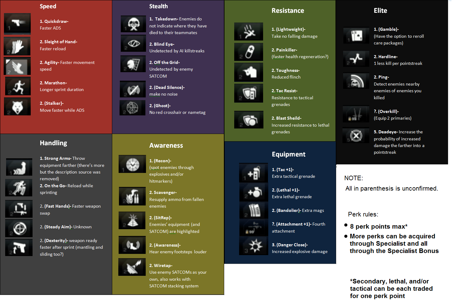
-- 3) make the more important buttons different colors, like with what I have going on in the "nerve staple" button
-- 4) consider a background design for the interiors of the HUD boxes (the grid overlay I have on them currently wasn't noticed so I need to bump that up and maybe incorporate something else
-- 5) the typeface selection is improving, but everything everywhere is all caps and it's making the interface stand out too much, so I need to reign it in

Style Sheet 3

Layout Pass 3v3
So I've gone back in and applied most of the feedback from the previous round i.e. slimmer frames on the HUD, less CAPSLOCK text, and attempting to draw the eye to the important areas with more distinguishable button states/colors/text color. I'm going to see how I like having black text as selected text as a way to distinguish more from the normal light text on dark backdrop.
And now for something new. I've been waiting to post here until I had a little bit more refined iterations, but I figure it's my blog...so I'm going to start showing some sketches and places that I'm drawing inspiration from.

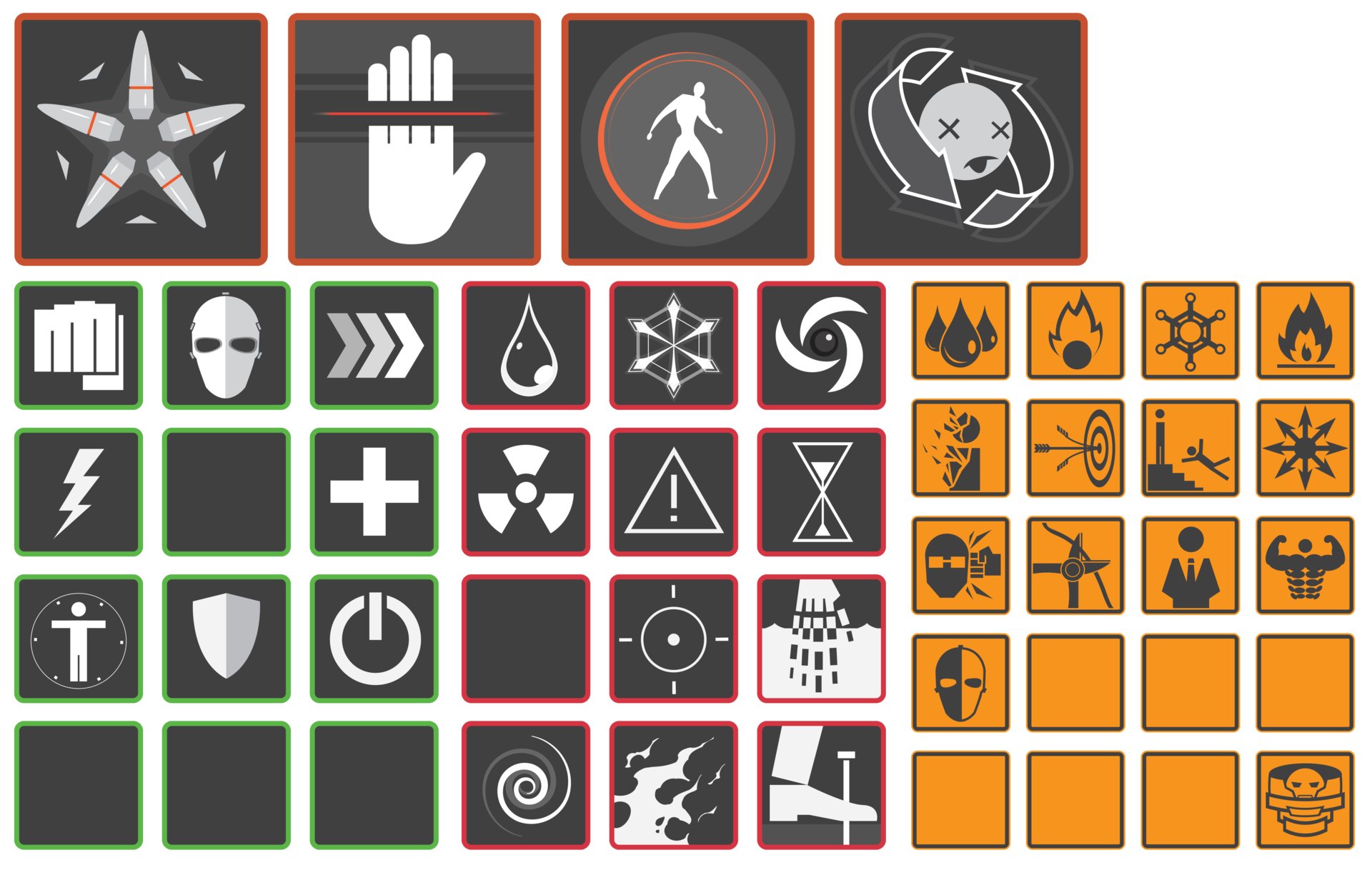
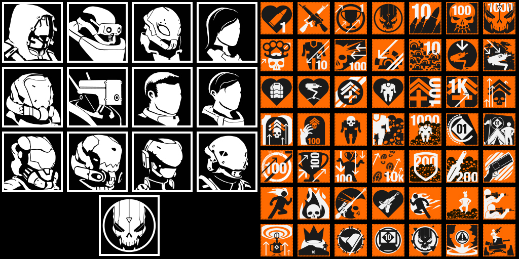
Icon Sketches
Here are some first pass sketches at some ideas I have knocking around for icons on the tech tree that the player can research in this game. It was an experiment to see whether or not this hologram-esque look I had in my head is feasable, and the answer is...it's not. At least in this iteration. Things look too mushy, and are losing their iconic-ness because of how mushy all of the glows are starting to make them look. So I think that a direction I'm going to push these in for a more refined pass is a one or two color flat icon with no glows.
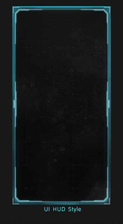

Here'es some more experiments I'm doing with making the HUD backdrop feel more lived in with some textures. (textures found here -- http://elyssafawn.deviantart.com/art/Screen-Mode-Texture-Pack-546039287 )
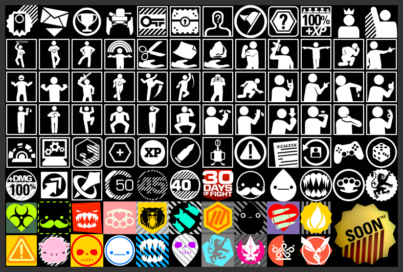
Inspiration for the directions that I'm going to continue to take the icons in --
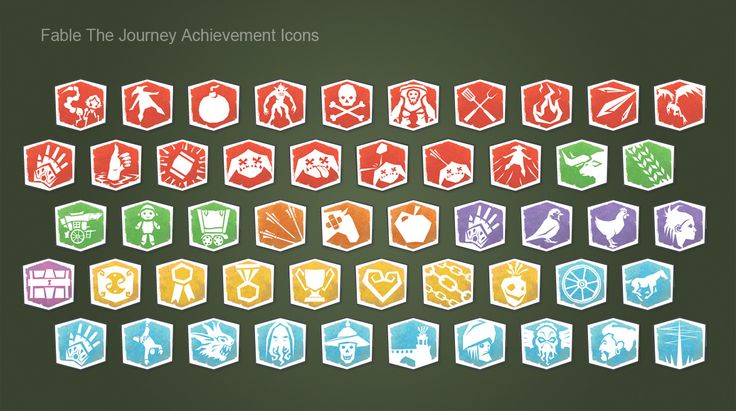
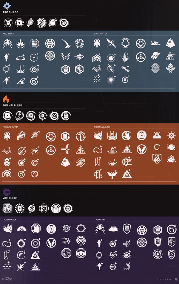
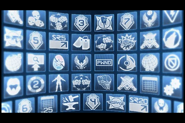
Other games I'm looking at for inspiration from their UI both aesethetics and how they function--
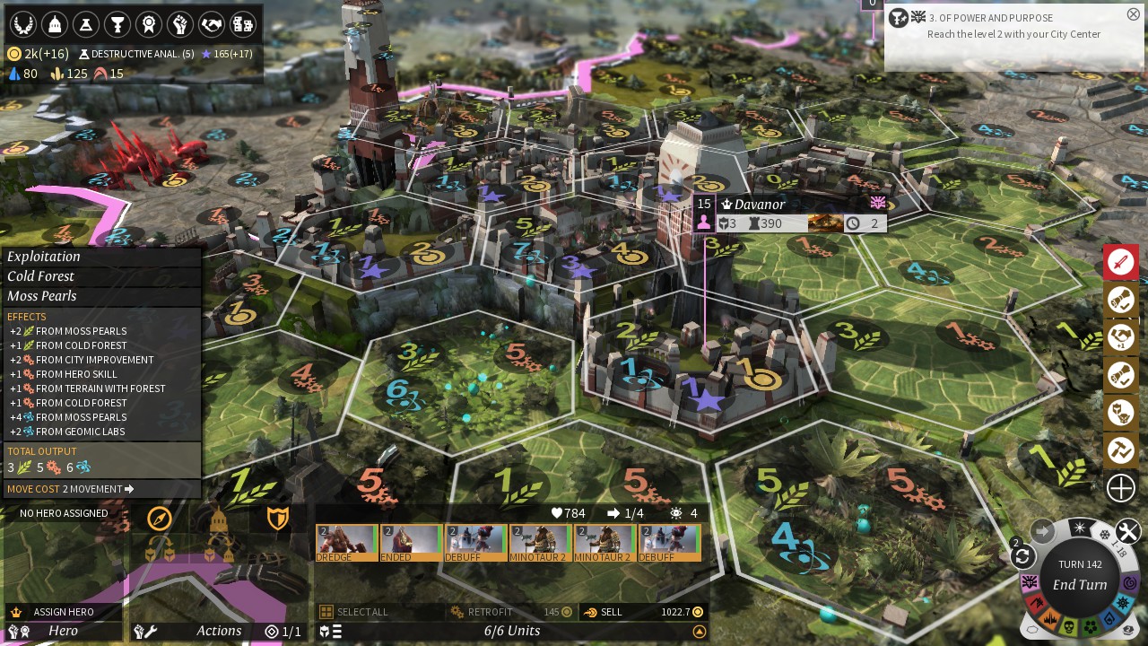
Endless Legend
No Way Out -- https://www.artstation.com/artwork/no-way-out-ui-design

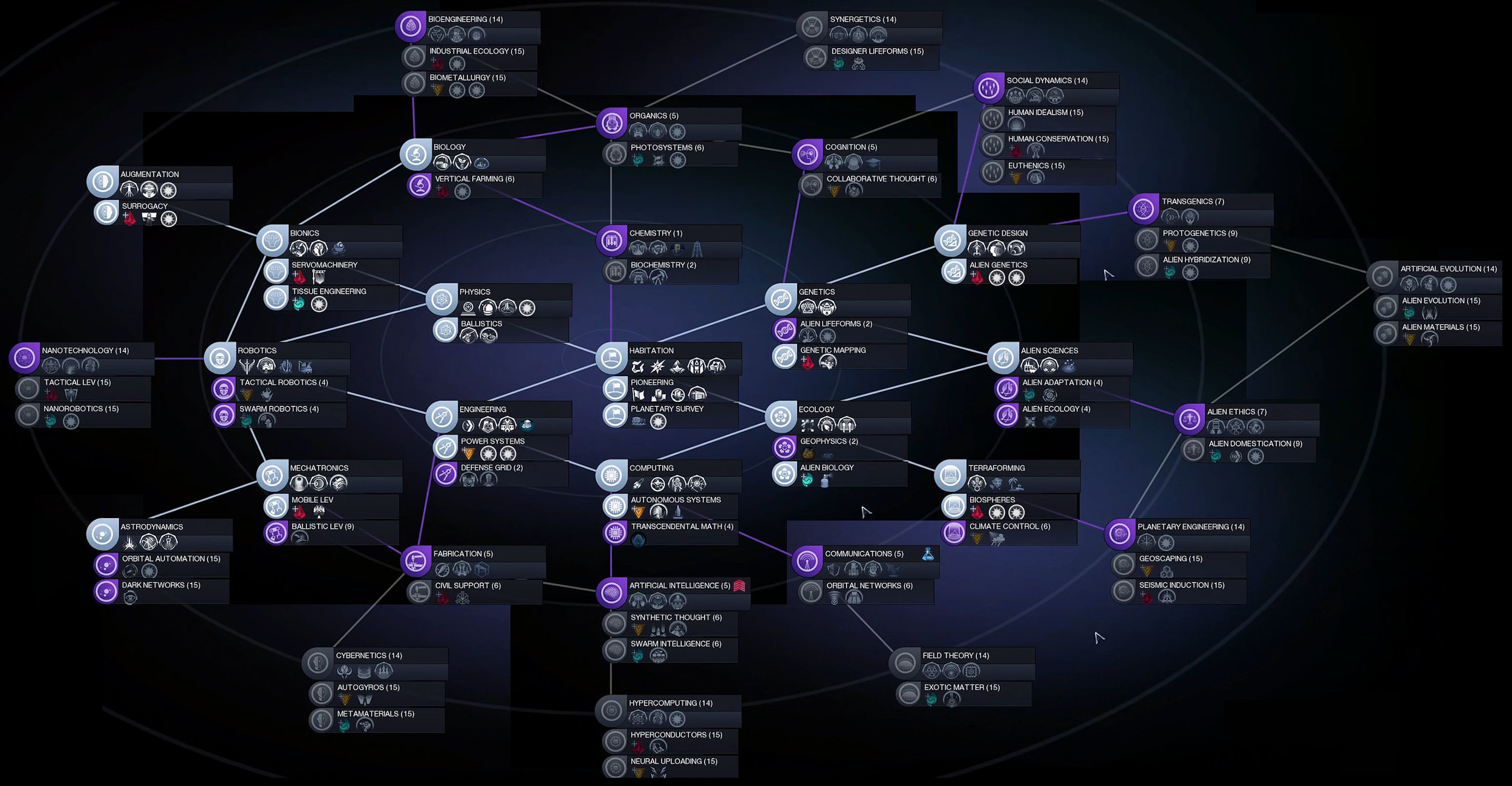
Civilization 5

Civilization Beyond Earth