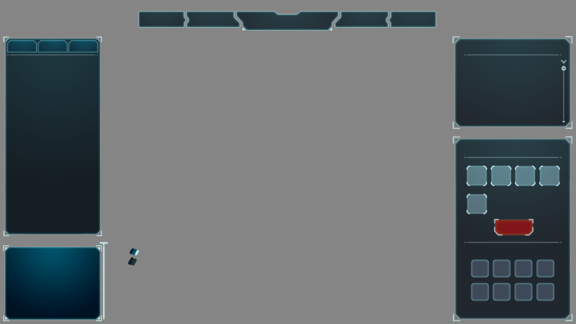
First pass
So, this project has been picking up the pace, slowly but gradually. The first thing I'm going about doing is redesigning the Governor/City Management screen. My thought process was that I want to give the game some screen space to breathe. The original Governor HUD took over the entire screen. I'm taking some inspiration from other 4x Strategy Games like Civilization and Endless Legend here and allowing the player to still see what's going on behind all of the dialogue boxes that make up this HUD.
The first big pass I did got pretty close to what I had in mind in terms of shape language -- angular and boxy, with a little bit of dimensionality from being transparent. Originally I went with a little bit of color, but felt like to really get the slick Sci-Fi feel that I'm going for I needed to make the overall palette more subdued with the main boxes being a transparent gradient of grey to black.
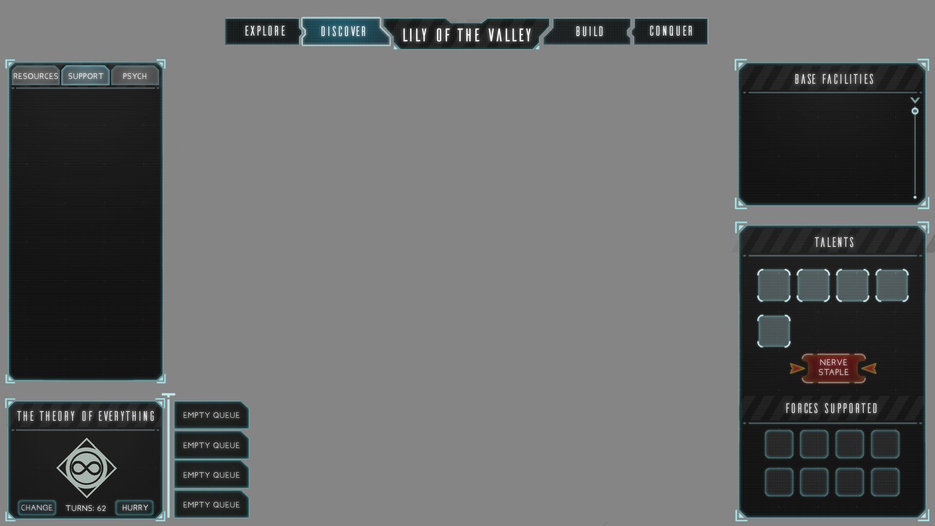
Second Pass
The second pass I did was to try and refine the look and feel of the shape language I'm leaning towards and start looking for some typefaces that would look nice with the UI overhaul. It's good to get a second pair of eyes on what I was doing though, because Dave was confused with the mixing of rounded buttons with angular shapes everywhere else.
Style Sheet
Another thing that wasn't jiving was the caution slashes. I threw them in to see what it'd look like because I similar slashes overlayed in HAWKEN's UI.
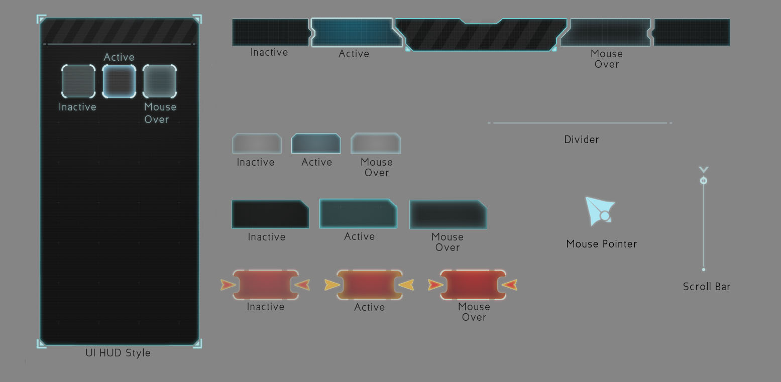
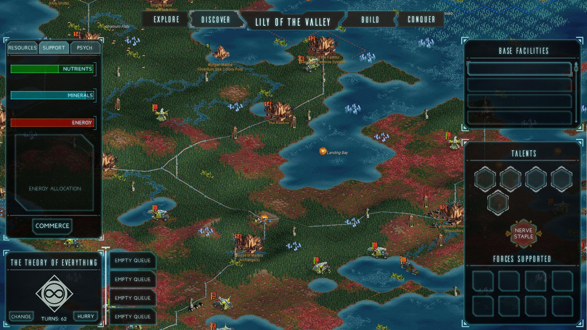
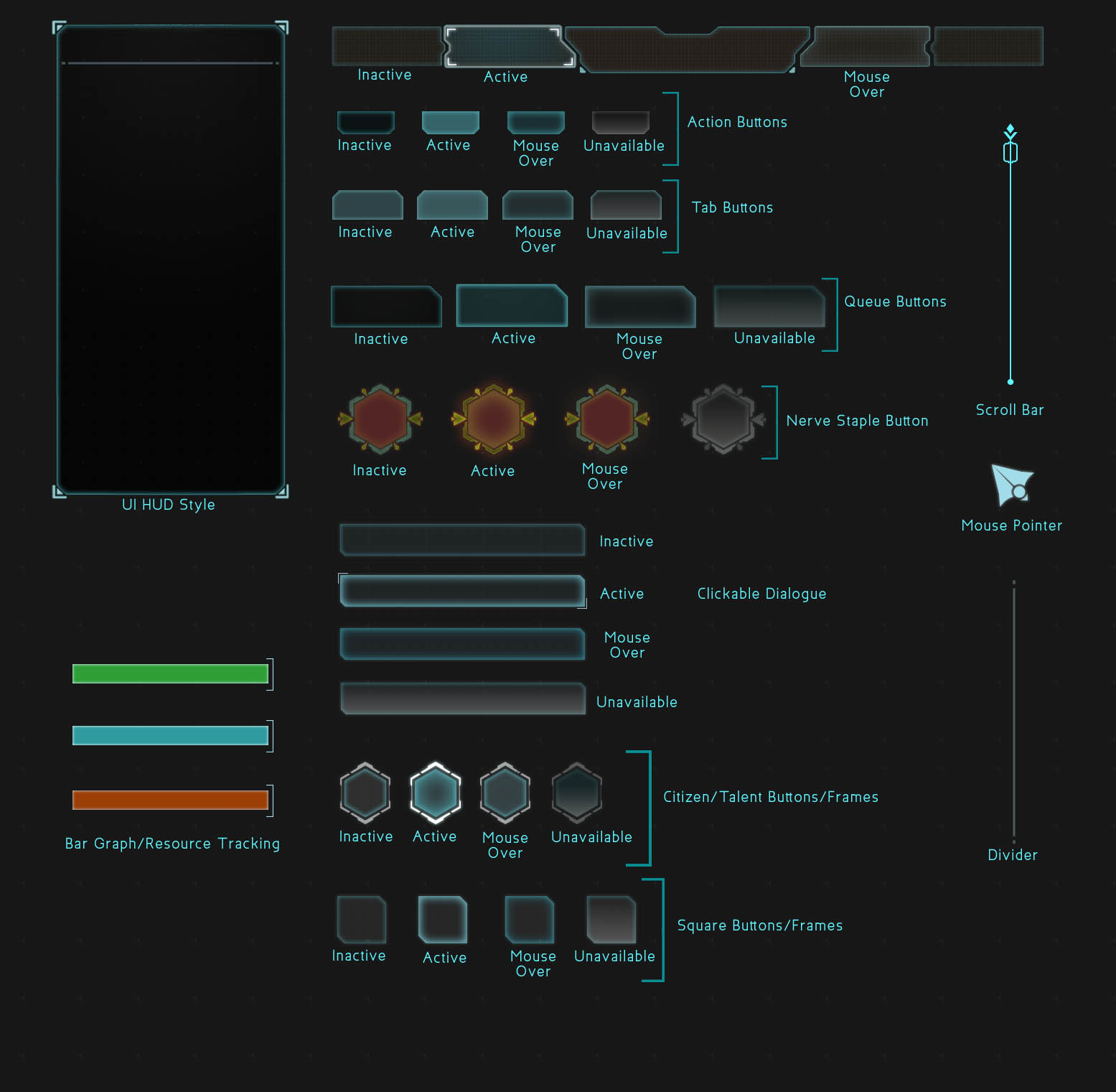
Third Pass
Style Sheet
In my third and most recent pass, I've consolidated the overall shape language to being angular and boxy, removing rounded buttons across the board. Dave's feedback on this pass was that it's looking good, but he'd like to see it have more character and be less clean overall. So from here on I'm going to be working on introducing some variations to the glows in the boxes so that they're not so perfect and consistent all the way around, that way they'll be more interesting to look at. Also on the list of things to do is keep looking for better typefaces that'll fit the vibe I'm going for.