Got some feedback from Dave this week, since its been a bit since we've met up and he's been able to check out what's going on.
Right off the bat, he'd like to see more saturated colors everywhere. Partially that's my fault for designing everything and then dropping the opacity and putting them through different blend modes in order to get the transparency effects that I have going on almost everywhere. This is something I'm going to have to address with some color overlays, or that I can go in and add some magic via After Effects and this lovely lovely plugin that I adore so much -- http://www.videocopilot.net/tutorials/color_vibrance_plug-in/
He likes that I've gotten control of my type choices since the last time he checked it out. Previously when he had seen it, everything was basically stuck in CAPSLOCK and he felt like the interface was screaming at him.
Like I mentioned in a previous post, I've been messing with differentiating selected buttons from non-selected buttons. I've been doing this by changing the text color to solid black to stand out against a brighter background, but Dave says it's not working. His eyes were more drawn to the two tabs in the beginning that aren't selected, so I should switch my thinking on what's going on there.
He liked the icons that I have going on at the moment. Likes that some are centered, some go to the edges, and some are angled. He doesn't like that when the research icons all drop down, it's a wall of the same drab color. So like I was thinking in a previous post, I'm going to have to revisit my approach with the icons and introduce more colors. Maybe I can be successful with a 2-3 color scheme -- background, details, main focus of the icon.
Another thing regarding the icons, he's interested in the shape language of the boxes and the icons enough that he'd like me to explore adding a cool mouse over flare for them since those would be clickable.
Lastly, he's a big fan of the flashiness of what I have going on in the "Design Workshop" screen. Again I need to address how the colors of things are skewing towards muddy and change them so that they pop and make things more interesting to look at, which is going to help it even more because the animation whiz bang stuff that I have going on is heading in such a cool direction.
Really liking the direction this project is trending in now. I really like mocking up animations to show how all of this stuff will look, and I feel like getting the Design Workshop screen down was a pretty big step, and the pizazz that I have going on there is going to affect how I approach animating going forward. Part of what makes it so successful in my opinion is the speed of things appearing and moving on the screen. Up until this point I feel like most of the animations have felt very labored and heavy handed -- while it's hard to make glowing buttons exciting, I do still feel like I can speed things up in the beginning portion of this animation quite a bit. There's still a lot to do, and things from the previous blog pos that I haven't gotten to address, but I'm hoping that this next week will just be all about the polish of things, and less about adding content.
User Interface
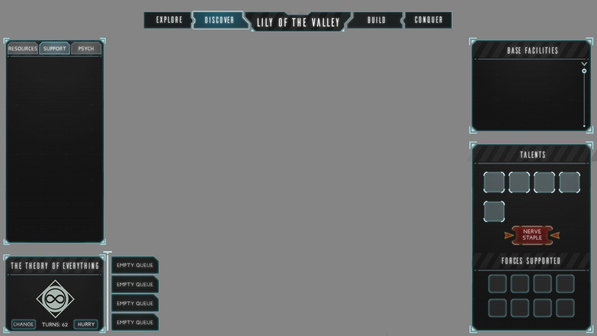
Continuing to adjust and make improvements, but this time in motion!
Here's my most recent iteration of things in motion, using animation states from my most recent Style Sheet. From here on, I'm going to continue to add to things while going back and adding more whiz bang effects and animations on top of older elements.
Things I'm noticing now that will be addressed in the next animatic -- not enough attention is being drawn to the Talents section when the "Psych" tab is clicked. The shiny glow I have going on in that divider is just not noticeable in my peripheral vision. It should be more noticeable to draw my attention away to the other side of the screen to show me what I should be looking at. Also, the timing of the transitions between selected and not selected on the "Resources/Support/Psych" tabs is clunky and slow. I need to speed that up.
The rest of this post is going to be going into how I got to what is being shown in the animation.
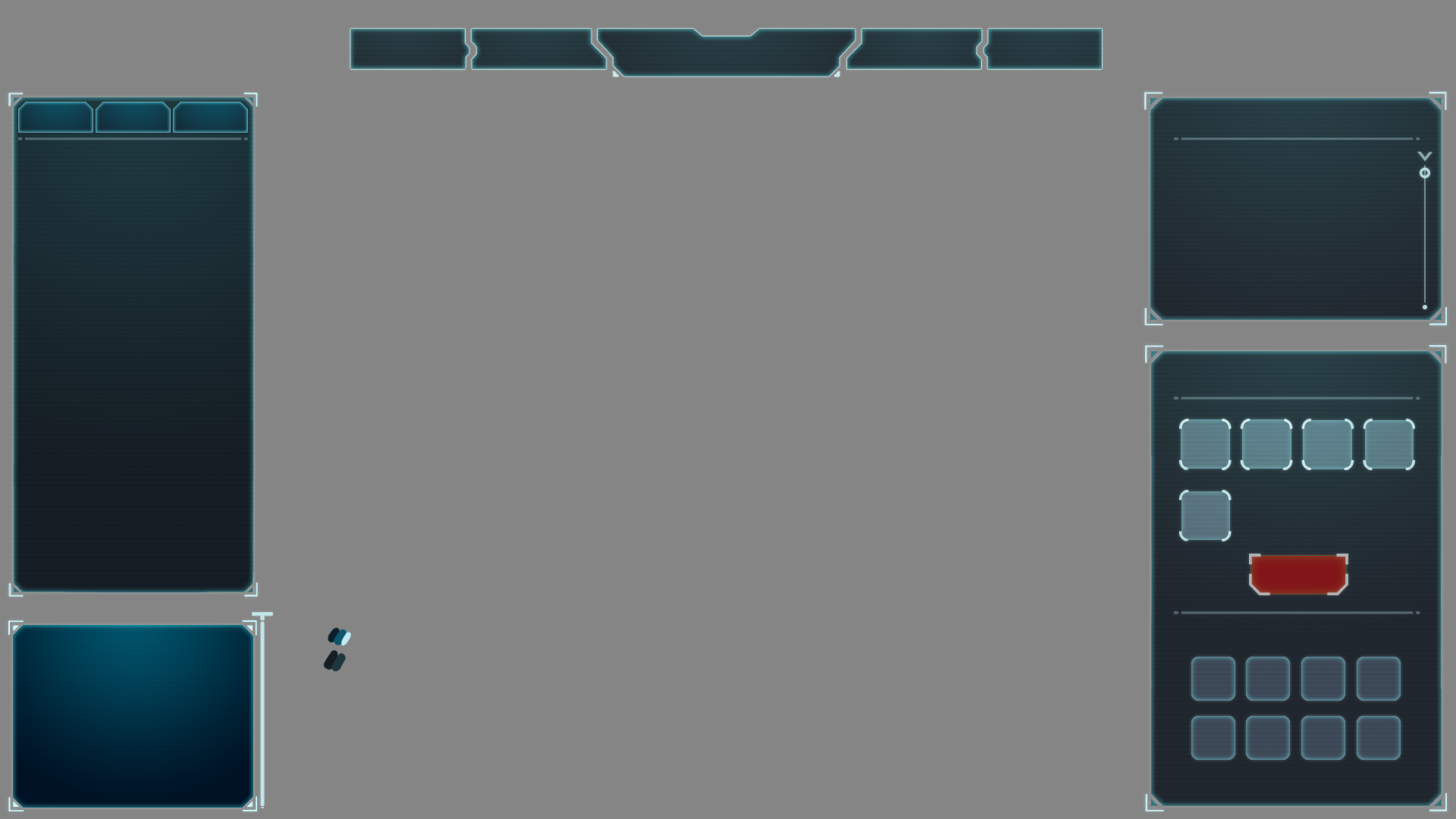
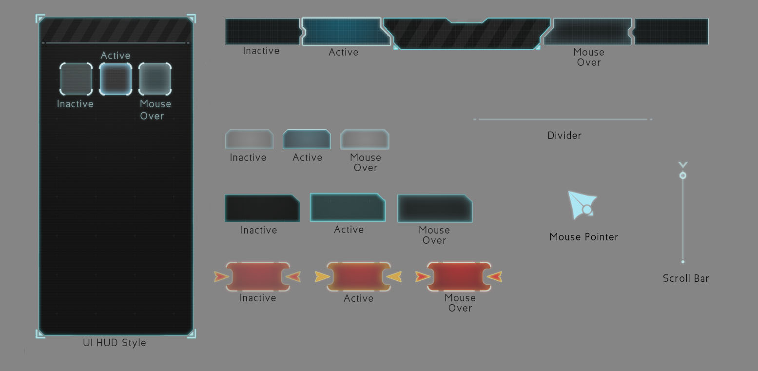
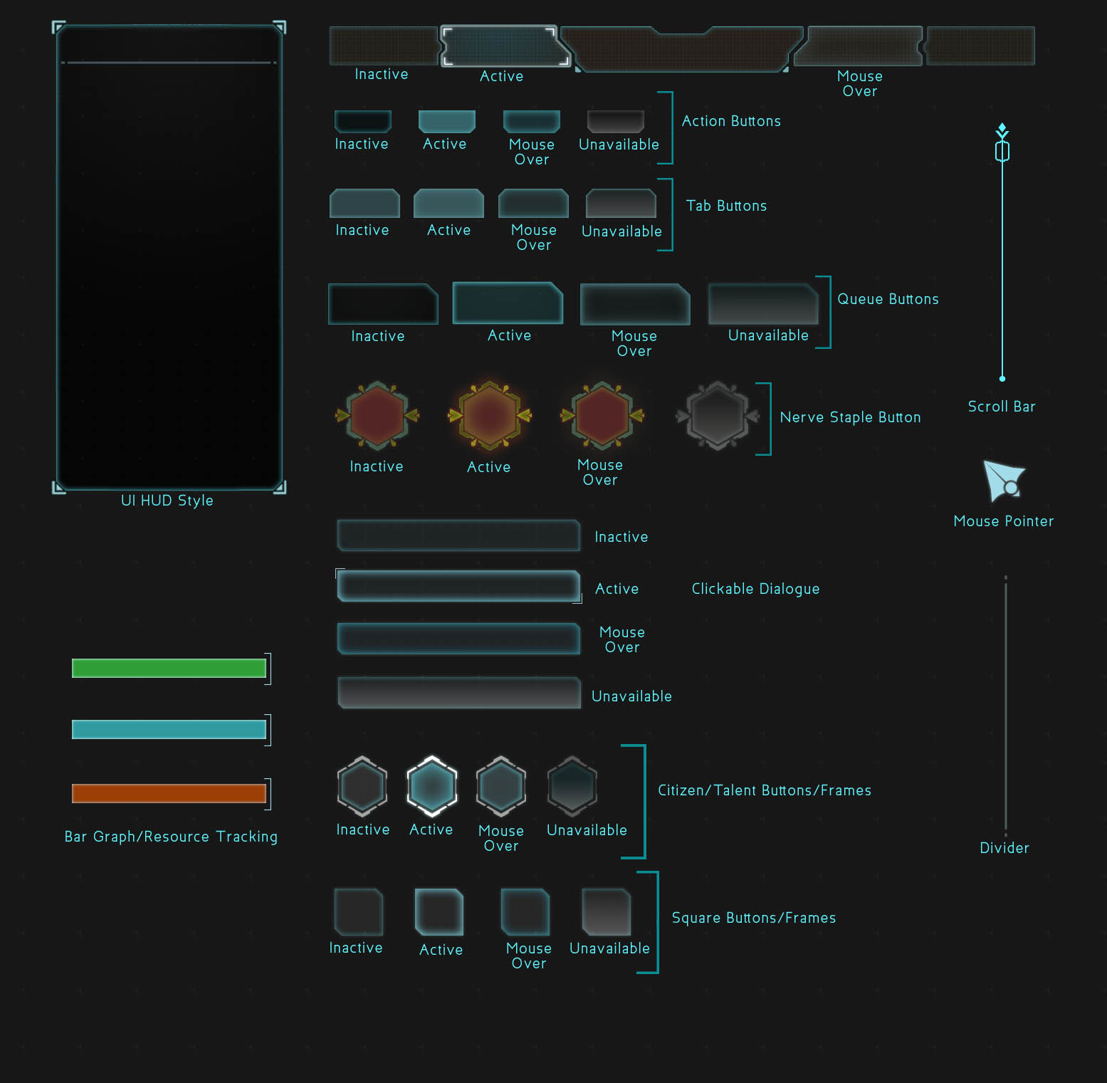
Style Sheet
This is my most recent Style Sheet, which I'm using as a guide for the different animation states shown in the mockup.

We have Icons!
Here are some more finalized versions of research icons based off of the sketches that were shown in the previous blog entry. I like the flatness of what's going on, but personally they're still a little muddy, and I'm considering bringing in a second color to help add more visual flair. As icons, some are still a little iffy on what they're trying to convey. "Stockpile Energy" is super on the nose and I need to make a version that sits better in that space. "Relocate Headquarters" should feel more like a fort, and less like a Rook in chess.
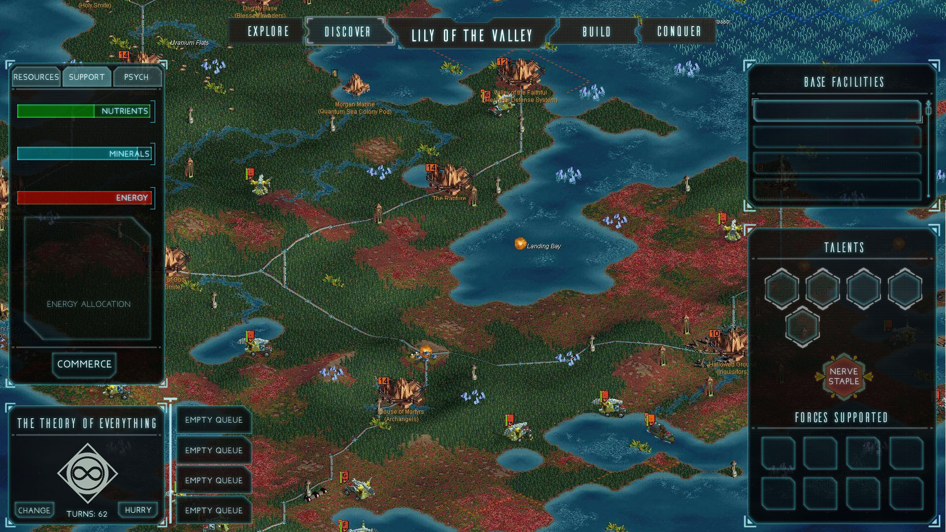
This version of the research screen isn't the one that was used in my animated mockup. I actually went back into this and scaled things down to give more breathing room so that the player will be able to parse this literal wall of information that they're seeing.
With Top Bar
No Top Bar
Here are two versions of the iteration that made it into the animated mockup. The only thing different is that I'm deciding whether or not to include the top bar, as that has information that could affect the player's decisions on what to research. I just liked the open space above the city name.
In the next pass I'm going to add more to the information happening on the top bar, which will make it more vital towards gameplay. I like how another 4X game like Endless Legend and Endless Space manage to go without using the top bar for information, and I think that Civilization: Beyond Earth might have too many different icons on its top bar -- I think I'd just like to find a balance between providing useful information to the player and providing too much information without context to the player.
Endless Legend
Endless Space
Civilization:Beyond Earth
Progress so far -- what's working and what's not.
First pass
So, this project has been picking up the pace, slowly but gradually. The first thing I'm going about doing is redesigning the Governor/City Management screen. My thought process was that I want to give the game some screen space to breathe. The original Governor HUD took over the entire screen. I'm taking some inspiration from other 4x Strategy Games like Civilization and Endless Legend here and allowing the player to still see what's going on behind all of the dialogue boxes that make up this HUD.
The first big pass I did got pretty close to what I had in mind in terms of shape language -- angular and boxy, with a little bit of dimensionality from being transparent. Originally I went with a little bit of color, but felt like to really get the slick Sci-Fi feel that I'm going for I needed to make the overall palette more subdued with the main boxes being a transparent gradient of grey to black.
Second Pass
The second pass I did was to try and refine the look and feel of the shape language I'm leaning towards and start looking for some typefaces that would look nice with the UI overhaul. It's good to get a second pair of eyes on what I was doing though, because Dave was confused with the mixing of rounded buttons with angular shapes everywhere else.
Style Sheet
Another thing that wasn't jiving was the caution slashes. I threw them in to see what it'd look like because I similar slashes overlayed in HAWKEN's UI.
Third Pass
Style Sheet
In my third and most recent pass, I've consolidated the overall shape language to being angular and boxy, removing rounded buttons across the board. Dave's feedback on this pass was that it's looking good, but he'd like to see it have more character and be less clean overall. So from here on I'm going to be working on introducing some variations to the glows in the boxes so that they're not so perfect and consistent all the way around, that way they'll be more interesting to look at. Also on the list of things to do is keep looking for better typefaces that'll fit the vibe I'm going for.